Starbucks Choice UX/UI Project

UX / UI + DATA VISUALIZATION
STARBUCKS CHOICE
An important part of the Starbucks brand is to make customers feel that their order is customized to them. With a menu full of endless drink combinations, for customers with dietary restrictions, it can be hard to know what is exactly in their drinks especially when ingredients are not listed. Right now Starbucks only lists milk alternatives and some sugar free syrups.
With this lack of representation in their menu, there is nothing that specifically targets a demographic with dietary restrictions or people who seek healthy alternatives.

SOLUTION STATEMENT
Create an interactive table projection for users to navigate the Starbucks menu based on dietary restrictions and preference with the opportunity to learn more about the Starbucks brand.
RESEARCH
With market research we found that Starbucks already has conducted studies to accommodate their customers with dietary restrictions with a variety of milks and sugar/dairy free syrups. However they are not making it known with their drink options. They list some alternatives but do not have a drink that targets this demographic.
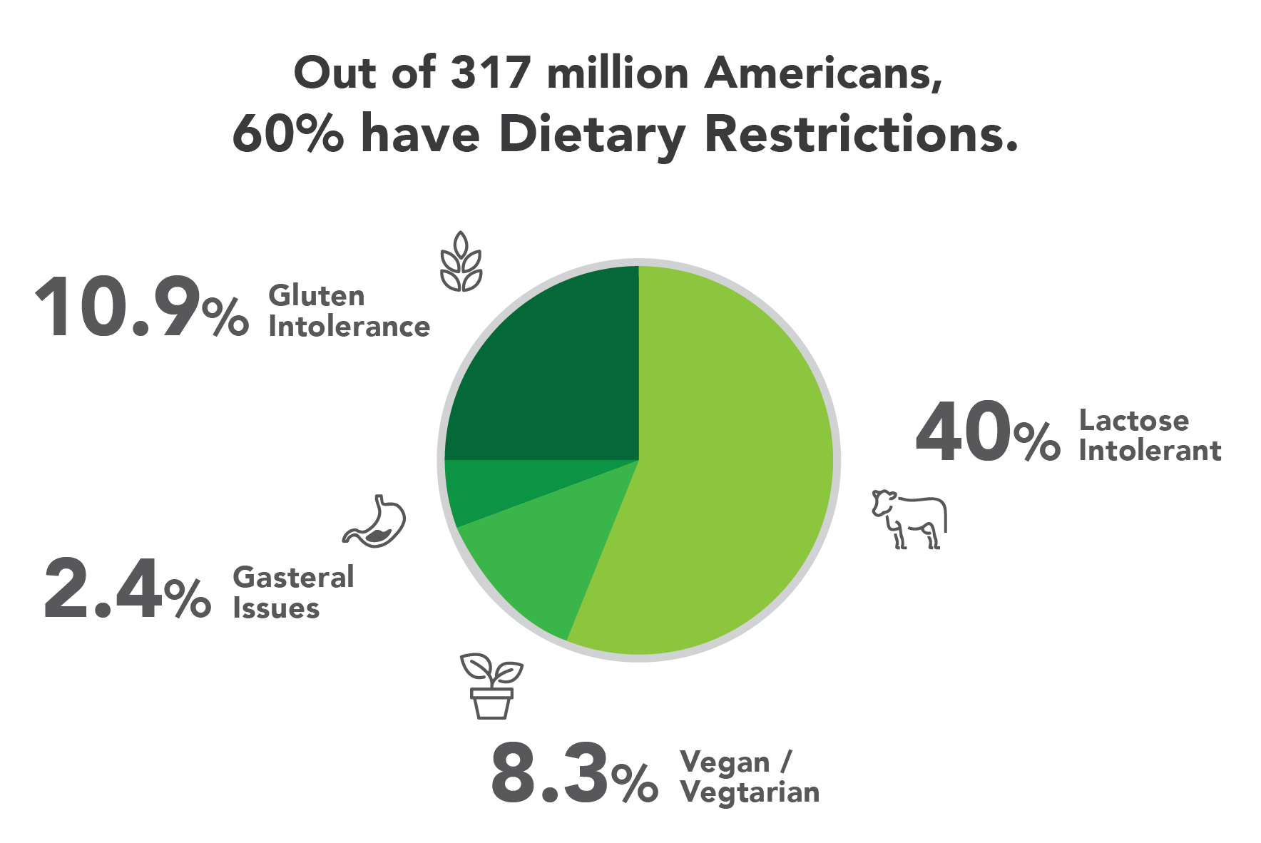
With 60% of Americans having dietary restrictions, it is apparent that we need to make a change to better accommodate them on the menu.
Starbucks is already improving their non-dairy section on menus. From their customers, they received 84,000 votes to add coconut milk to their menu in 2014.

COMPETITORS
In our research, we found that competitors of Starbucks included Dunkin’ Donuts and McDonalds. The three offer coffee and food to customers, but have differences in how the engage and see their product. Starbucks offers their locations as a place to work and socialize. Dunkin uses advertisements to engage with customers while McDonalds uses their well established fast food chain to appeal to its customers.
INTERVIEWS + ETHNOGRAPHY
We interviewed 4 people: 2 with known dietary restrictions and 2 baristas.
We wanted to understand our user and environment, so we visited local coffee shops and studied how long people were typically looking at the menu and how long they were staying after ordering. After a while, we asked customers about their drink choices. Here is what we found:
People were coming here to work, socialize, and relax
Times could vary depending on the person
Customers often ordered the same thing depending on where they were
Menus were difficult to read and understand
Not sure of drink Ingredients
Baristas say they are not properly educated on dietary restrictions in training, but do make sure to accommodate customers appropriately, though some mistakes do happen.
SURVEY
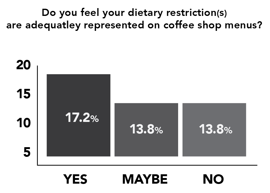
In our own survey of 29 people, 25 said they drink coffee and 16 said they have dietary restrictions such as Veganism, Lactose Intolerant, and Gasteral Issues. We asked them varying questions from here, such as if they feel represented at Starbucks, taken seriously when ordering, and if they would like to see the ingredients beforehand. These are our results:


DEMOGRAPHIC
We are aiming to to provide an alternative method for:
Customers with dietary restrictions (Lactose Intolerant, Vegan, Nut Allergies, etc.)
Health-conscious customers
USER PERSONA + SCENARIOS


GOAL
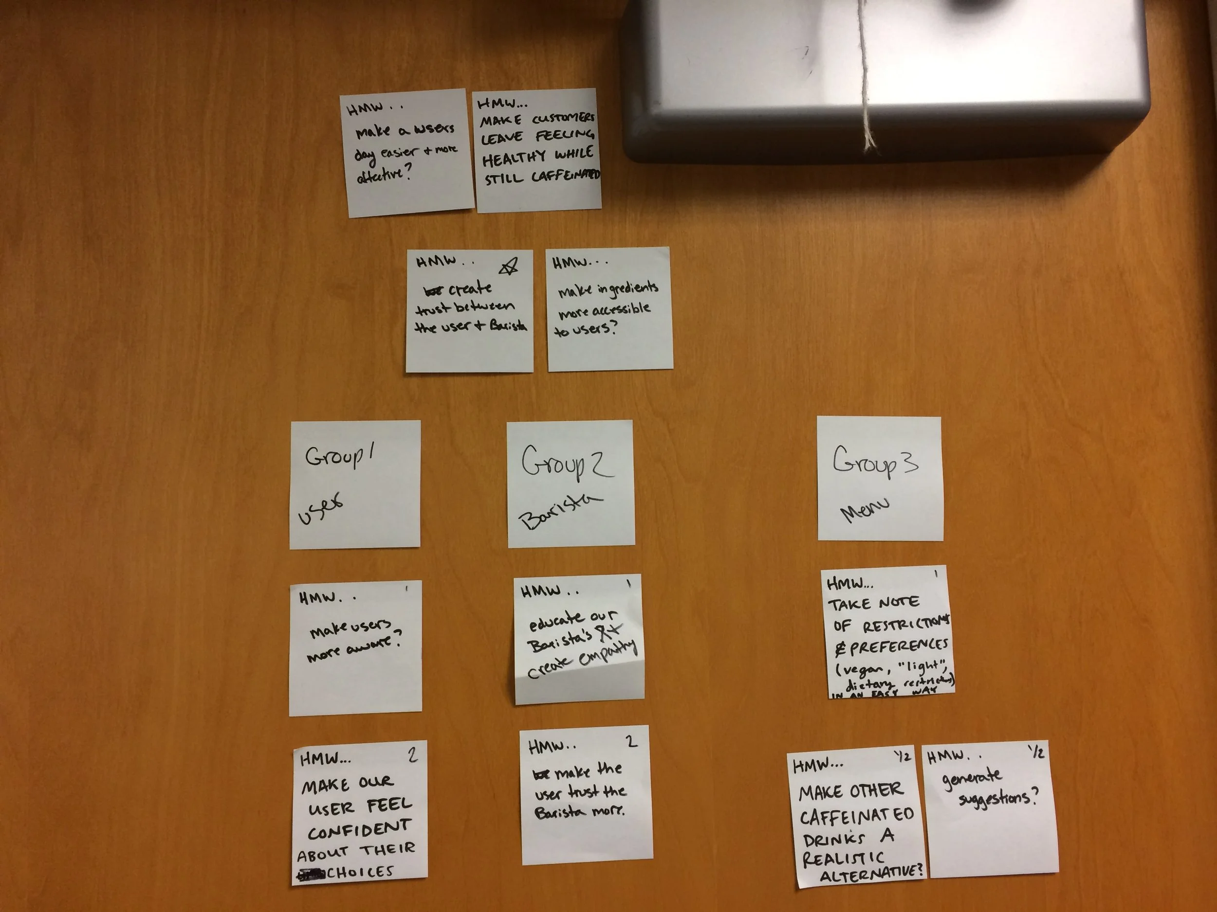
Make the customer's experience positive
Create trust between the customer & Barista
Make ingredients accessible to the customer
Hopefully our user will be more aware of what they are consuming, our barista will become better educated and have empathy, and our menu will take note of restrictions.

SOLUTION STATEMENT
Create an interactive table projection for users to navigate the Starbucks menu based on dietary restrictions and preference with the opportunity to learn more about the Starbucks brand. This would be an installation at a single Starbucks location in Ballard, Washington.
By taking a short quiz, our system is able to generate a drink for the user based off of their answers. The user will be able to order and pay for any drinks as well as add from our regular Starbucks Menu. Once the user has ordered, they are able to further engage the table and interactive with graphs and graphics from the Starbucks Roast and Health sections.
A customer looking to get a drink on the go will also be able to have the same experience by using one of our kiosks. They can still go through the quiz and pay but will not be able to see our Starbucks Roast and Health sections. After ordering from the kiosk, customers would wait at the counter, like any other Starbucks.

USER FLOW

PROCESS

After creating a user flow, we started building pages based on our results from our survey. The important aspects being: showing the ingredients and giving the user more than one drink option. This feature would be calculated based off of the answers the user selected.
PROTOTYPING

Our first prototypes were paper/pen and contained the interface for the table projection. Many users were not sure of what they were trying to achieve with the custom drink quiz and also what our information page was supposed to be. We decided against having articles about diet on the information page, instead utilizing the environment and allowing the user to engage with the table even more. We also added more navigational graphics to the Home/Welcome Page.

Our screens needed to stay within the Starbucks brand, so we presented these screens to potential users, to see what they gravitated towards. We found that users typically did not want to see a black or white screen on their table. Instead they wanted to be able to see the actual table with the icons and text just overlaying it.
We also were faced with the challenge of naming this off brand Starbucks location. We initially named this project Starbucks Alternative, because of the options we were presenting users that weren’t typically seen on the menu.After some feedback we decided to change the name to Starbucks Choice because we felt it gave the user more power when it came to choosing a drink that suited them.

In our second phase of prototyping, we took our refined tables and put them into InVision. Our main takeaway was how were we going to distinguish our home page and our information page. What is our home page? Is it the information page or is it the first screen that pops up when you sit down?
We decided we needed to get rid of the naming “home” and “info” because it was creating too much confusion. Instead we used the Starbucks logo as our info page because users typical saw that logo as something they would click to take them to a web page our information page. The start over or add buttons would take the user back to the first screen of the quiz.
FINAL
TABLE SCREENS


KIOSK SCREENS

We would hope that some day this would be an installation in all of Starbucks locations or at least some how incorporated weather it just be with a kiosk or a few tables. We would also like to proceed by incorprating this system into the Starbucks app and website so customers could use this process any where.
THE TEAM
Kaitlyn Church : UX Researcher, Ethnography, User Testing, Videographer
Grace Parziale : UX Designer, Developer, User Testing